
This year, we were inspired by colours during Salone del Mobile. Neutral colours, such as white, black and greyness still function as a perfect fit for other colours and neutral materials such as unseasoned timber and stone. However, this year many exhibitors decided to use colours as backgrounds for presenting their products.
Our attention was attracted mostly by colour schemes of the Arper, Muuto and Artek stands.
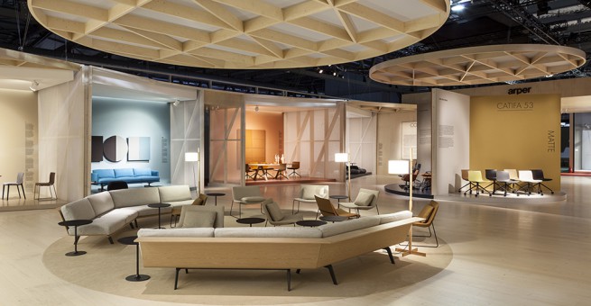
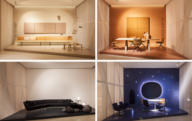
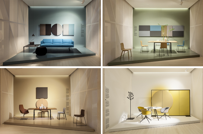
The perfectly designed ARPER stand held our breath in amazement due to its visual and aesthetic qualities. Different product lines were presented in separate areas divided with transparent walls on a wooden frame. Each area told a different story where the suitably used colour of the background emphasised the key features of ARPER products.
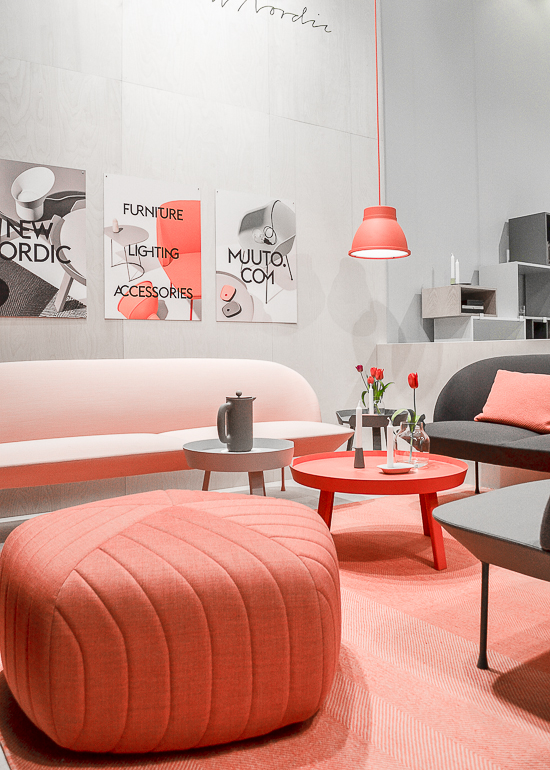
MUUTO, which celebrated its tenth birthday at the trade fairs in Milan this year, relied on muted rose hues supplemented with neutral greyness, both in case of the products themselves and the background on which the unique furniture and accessories of the Scandinavian producer were presented.
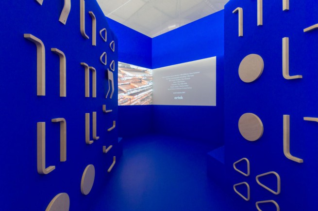
The intensive blue shade of the ARTEK stand was a distinctive and contrasting background for the lines of benches, sofas and armchairs covered with fabric designed by Raf Simons for Kvadrat. Our attention was also attracted by the arrangement of classic ARTEK furniture which beautifully decorated the stand.
Keep up with our new sweet projects and designs. We hope that soon we will find someone willing to follow the new trends 🙂
http://passionshake.com/top-5-trends-at-salone-del-mobile-2015/
http://www.inexhibit.com/case-studies/report-from-milan-furniture-fair-2016/
http://www.wallpaper.com/salone-del-mobile/2016?utm_campaign=facebook+&utm_source=social+&utm_medium=social+&xid=wallpaper_socialflow_facebook#154545
